Learning reactjs flux, node, electron ... (Part-15)
So far the UI for our project looked quite dull. And I was quite bored looking at the UI, so I decided to go for some styling. It was also meant to be a breath of fresh air for the project which was getting quite monotonous.
Instead of diving into all css, I chose to go for awesome material ui kit. I figured out that it should be pretty easy, as it is built for reactjs. All I need to do was download it and use its components instead of default html components. Well I was quite wrong didn’t turnout to be the way I was day dreaming.
Downloading was pretty easy:
npm install material-ui --save
Using material-Ui wasn’t that difficult either. All that needs to be done is to require the component that is to be used:
const Avatar = require('material-ui/lib/avatar');
const FontIcon = require('material-ui/lib/font-icon');
const RaisedButton = require('material-ui/lib/raised-button');
const TextField = require('material-ui/lib/text-field');
const Cards = require('material-ui/lib/card');
const Card = Cards.Card;
const CardHeader = Cards.CardHeader;
const CardActions = Cards.CardActions;
const CardText = Cards.CardText;
const Colors = require('material-ui/lib/styles/colors');
And use it:
return (<Card style={cardStyle} initiallyExpanded={true}>
            <div style=>
            <CardHeader
                title="Facebook"
                titleStyle=fontSize
                subtitle="Login"
                subtitleStyle=fontSize
                avatar={<Avatar>F</Avatar>}
                actAsExpander={false}
                showExpandableButton={false}>
            </CardHeader>
            <CardText>
                Enter the same username and password you use for login into facebook.
            </CardText>
            <CardActions expandable={false}>
                <form ref="loginForm">
                    <Vbox>
                        <span style={error} ref="credentialError">{store.errors.credential}</span>
                        <Hbox>
                        <Vbox>
                            <Hbox>
                            <TextField required={true} hintText="Username" type="text" ref="username" floatingLabelText="Username:" errorText={store.errors.username} />
                            </Hbox>
                            <Hbox>
                            <TextField required={true} hintText="Password" type="password" ref="password" floatingLabelText="Password:" errorText={store.errors.password} />
                            </Hbox>
                        </Vbox>
                        </Hbox>
                        <Hbox>
                        <RaisedButton label={store.isInProgress ? "Login..." : "Login"}
                                        ref="btnLogin"
                                        disabled={store.isInProgress}
                                        primary={true}
                                        onClick={this.dologin.bind(this) }
                                        backgroundColor={Colors.teal600} />
                        </Hbox>
                    </Vbox>
                </form>
            </CardActions>
            </div>
        </Card>);
Easy-peasy!! Now let’s run it… Lo!! The program would not more compile, because material-ui is expecting latest version of reactjs, we have v0.13 and as of now the version is 0.14. Hmm, yup not so bad, updating should be pretty easy..
npm install react --save
Now program does run but it started giving all sort of weird warnings related use of ReactDom instead of React. So, the problem is the fact that react has depreciated DOM operations through React object, it now prefers ReactDom object for dom related operations. Hmm, shouldn’t be so bad after all.. All I need to do is include the react-dom module:
import * as ReactDom from 'react-dom';
And use it..
Well it turns out ‘react-dom’ also requires a seperate tsd file. So, here we go:
tsd install react-dom
Another warning was about directly rendering into body, so I added a new div with id “fb-messenger”, and rendered into the div as such:
ReactDom.render(<App />, document.getElementById("fb-messenger"));
Finally!! the program actually started running, but I cannot login. Hmm turns out I had kind of hard dependency on the Html input elements to get the username and password. So, I had to change doLogin method of login.tsx file, to get username and password Material-UI component way…
var form = (ReactDom.findDOMNode(this.refs["loginForm"]) as HTMLFormElement);
var txtUsername = (this.refs["username"] as any);
var txtPassword = (this.refs["password"] as any);
var username = txtUsername.getValue();
var password = txtPassword.getValue();
Now I can login. There is new problem with friend list, but I’ll tackle it later.
I figured that while react is updated, why not update other packages too. So, I went forward and updated all possible packages. Bad! BAD! BAADD!! decission, a lot of them started failing, so I reverted back few packages that were failing. Some, package update required small code change to get fixed for example, facebook-chat-api changed “getCurrentUserId” to “getCurrentUserID”, a samll change indeed, but in case-sensative language it is enough to cause exceptions… Could have easily caught at compile time if I had been more hardworking and created an interface defination for the “api” object of “facebook-chat-api”, but hey I’m lazy, so I api as “any” type, which is dynamically typed, hence exception was caught only in runtime.
The “F” in avatar wasn’t really satisfactory, so I thought about using fontawesome to get facebook icon, it would also make easy to litter the app with a lot of icons in later stage. I went ahead and downloaded the font-awesome, and added the desired files/folders into style directory.
Need one more gulp task to copy font-awesome to our final build…
gulp.task('font-awesome', function () {
    return gulp.src(config.source + 'styles/font-awesome/**/*.*')
        .pipe(gulp.dest(config.compiled + '/styles/font-awesome'));
});
And use it:
gulp.task('watch', function () {
    gulp.watch([config.allTypeScript], ['less', 'font-awesome', 'browserify', 'atom']);
});

gulp.task('default', ['less', 'font-awesome', 'browserify', 'atom', 'atom-run', 'watch']);
With font-awesome resources now copied, its time to use it…
Include the stylesheet:
<link href="./styles/font-awesome/css/font-awesome.min.css" rel="stylesheet" />
Now use in avatar:
<CardHeader
    title="Facebook"
    titleStyle=fontSize
    subtitle="Login"
    subtitleStyle=fontSize
    avatar={<Avatar backgroundColor={Colors.pink400} icon={<FontIcon className="fa fa-facebook" />}></Avatar>}
    actAsExpander={false}
    showExpandableButton={false}>
</CardHeader>
The final code in login.tsx looks like this:
import * as React from 'react';
import * as ReactDom from 'react-dom';
import LoginStore, {ICredential, ILoginErrors} from "../stores/loginstore";
import LoginActions from '../actions/loginactions';
import AppStores from '../appstores';
import {Style, Hbox, Vbox} from './layout';

const Avatar = require('material-ui/lib/avatar');
const FontIcon = require('material-ui/lib/font-icon');
const RaisedButton = require('material-ui/lib/raised-button');
const TextField = require('material-ui/lib/text-field');
const Cards = require('material-ui/lib/card');
const Card = Cards.Card;
const CardHeader = Cards.CardHeader;
const CardActions = Cards.CardActions;
const CardText = Cards.CardText;

const Colors = require('material-ui/lib/styles/colors');

export class LoginProps {
    store: LoginStore
}

export default class Login extends React.Component<LoginProps, any> {
    constructor(props: LoginProps) {
        super();
        this.props = props;
    }

    dologin() {

        var form = (ReactDom.findDOMNode(this.refs["loginForm"]) as HTMLFormElement);
        var txtUsername = (this.refs["username"] as any);
        var txtPassword = (this.refs["password"] as any);
        var username = txtUsername.getValue();
        var password = txtPassword.getValue();

        if (form.checkValidity()) {
            LoginActions.authenticate({ username, password });
        } else {
            LoginActions.setErrors({
                username: txtUsername.validationMessage,
                password: txtPassword.validationMessage,
                credential: ""
            });
        }
    }

    render() {
        var store = this.props.store;
        var loginButton = {marginLeft: 77};
        var error = {marginLeft: 5, color: '#cc0000'};
        var cardStyle = {'display':'block','margin':'2px auto', 'width':'calc(100vw - 5px)', 'height':'calc(100vh - 5px)'};
        return (<Card style={cardStyle} initiallyExpanded={true}>
                    <div style=>
                    <CardHeader
                        title="Facebook"
                        titleStyle=fontSize
                        subtitle="Login"
                        subtitleStyle=fontSize
                        avatar={<Avatar backgroundColor={Colors.pink400} icon={<FontIcon className="fa fa-facebook" />}></Avatar>}
                        actAsExpander={false}
                        showExpandableButton={false}>
                    </CardHeader>
                    <CardText>
                        Enter the same username and password you use for login into facebook.
                    </CardText>
                    <CardActions expandable={false}>
                        <form ref="loginForm">
                            <Vbox>
                                <span style={error} ref="credentialError">{store.errors.credential}</span>
                                <Hbox>
                                <Vbox>
                                    <Hbox>
                                    <TextField required={true} hintText="Username" type="text" ref="username" floatingLabelText="Username:" errorText={store.errors.username} />
                                    </Hbox>
                                    <Hbox>
                                    <TextField required={true} hintText="Password" type="password" ref="password" floatingLabelText="Password:" errorText={store.errors.password} />
                                    </Hbox>
                                </Vbox>
                                </Hbox>
                                <Hbox>
                                <RaisedButton label={store.isInProgress ? "Login..." : "Login"}
                                              ref="btnLogin"
                                              disabled={store.isInProgress}
                                              primary={true}
                                              onClick={this.dologin.bind(this) }
                                              backgroundColor={Colors.teal600} />
                                </Hbox>
                            </Vbox>
                        </form>
                   </CardActions>
                   </div>
                </Card>);
    }
}
index.html:
<!DOCTYPE html>
<html lang="en">
	<head>
		<meta charset="UTF-8">
		<title>Facebook messenger</title>
		<link href="./styles/main.css" rel="stylesheet">
		<script type="text/javascript">
		var electronRequire = require;
		</script>
		<script src="./program.js" type="text/javascript"></script>
		<link href="./styles/font-awesome/css/font-awesome.min.css" rel="stylesheet" />
	</head>
	<body>
		<div id="fb-messenger"></div>
	</body>
</html>
program.tsx:
import * as React from 'react';
import * as ReactDom from 'react-dom';
import App from './components/app';

export default class Program {
    static main() {
        ReactDom.render(<App />, document.getElementById("fb-messenger"));
    }
}
Changed the dimension of electron window:
mainWindow = new BrowserWindow({
    width: 450,
    height: 450,
    frame: true
});
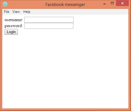
Finally the output:

How about a before after comparision:
Pretty satisfied, although reaching the destination was quite a work.
There are total 16 changes in this commit counting the newly added files, the diff of changes can be found here